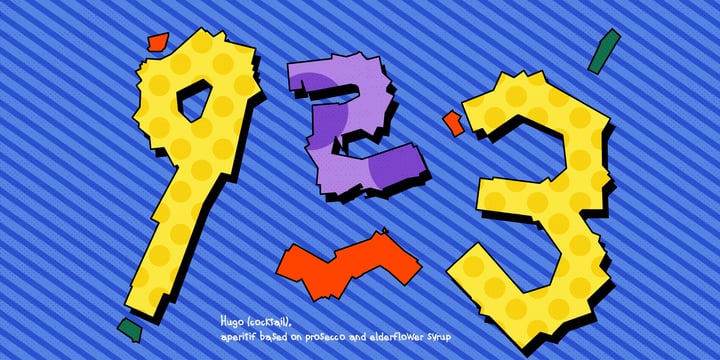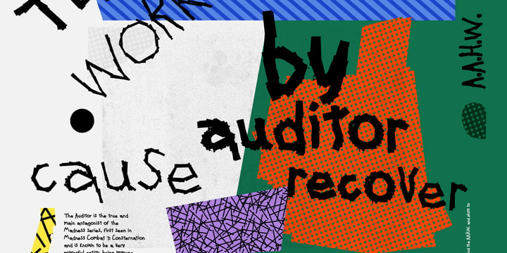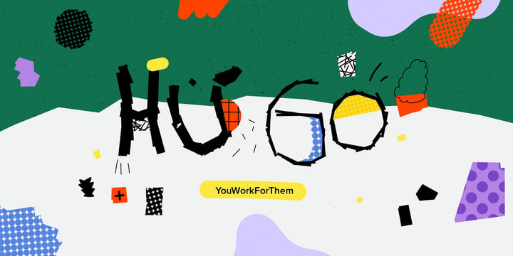
YWFT Hugo has a broken, scrawled quality that commands the viewer's attention by making them slightly uneasy: who is responsible for this crazy script, and more importantly, are they a safe distance away? At the same time, YWFT Hugo radiates a childlike innocence and joy, big sloppy blocks haphazardly forming words. That's the power of YWFT Hugo—it can go either way depending on your context. Its urgent simplicity and unique staggered quality make it the perfect choice for poster art, web design, packaging, educational tools, social media, art projects, branding, magazines...wherever you need a sloppy, blocky, abstract print.
YWFT Hugo includes opentype features like alternates, and a larger 500+ glyph set.

My eldest son Sam always wanted to visit Japan and he has been saving up for a ticket for years now. We should have traveled there this year, but due to the pandemic, that was impossible. We’re now trying to go next year.
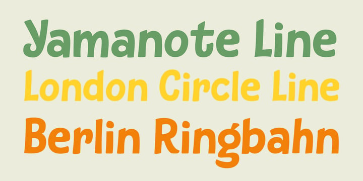
Sam and I did make some kind of itinerary and I told him how we were going to get around, as I have been to Japan many times. I told him about the Shinkansen trains, the cute Tram in Nagasaki and the immense subway system in Tokyo. One of the lines in Tokyo is the so-called Yamanote Circle Line, which I have used on numerous occasions.
A new font name was born and it stuck to this particular font!
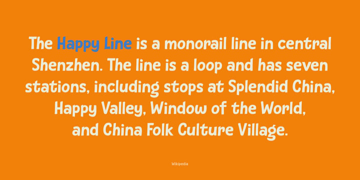
Subway Circle is a 100% handmade font. It is rounded, slightly slanted and comes with a sunny disposition. I am sure that, when you use it, you will find your 生きがい… ;-)
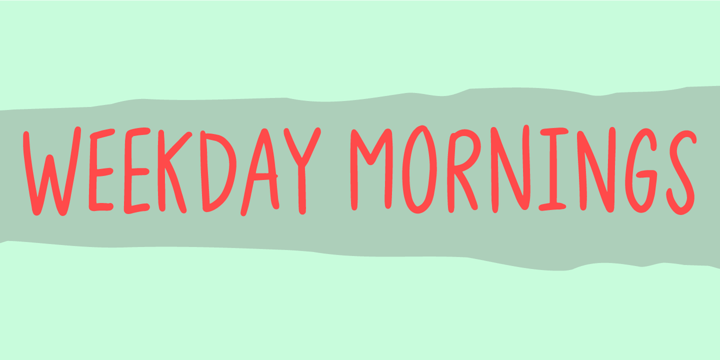
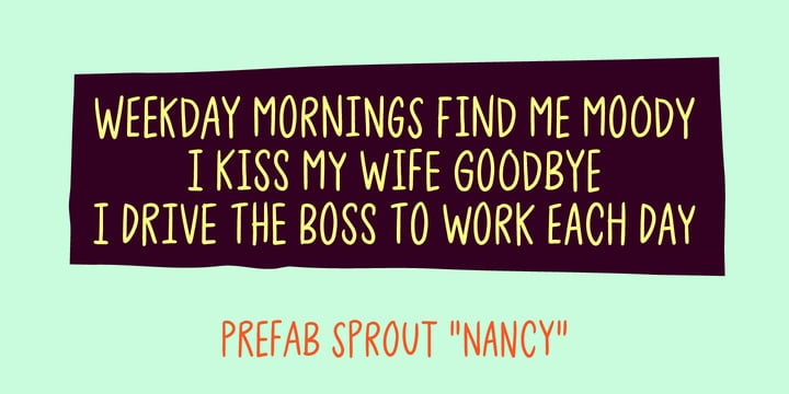
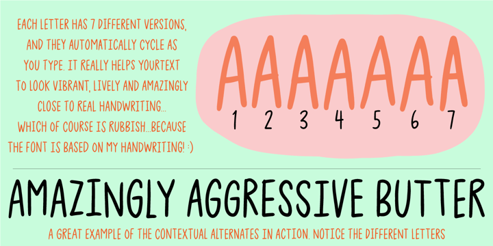
"Weekday Mornings" are the 2 first words from the song "Nancy" by Prefab Sprout. Just like the song, the font has a romantic theme and could be considered as "easy listening". Well, I've added 7 slightly different versions of each letter, enough to make the font look like the real handwriting which was the base of the font.
Fun fact: I had this song on repeat when finishing the font. I still do love that song! :)
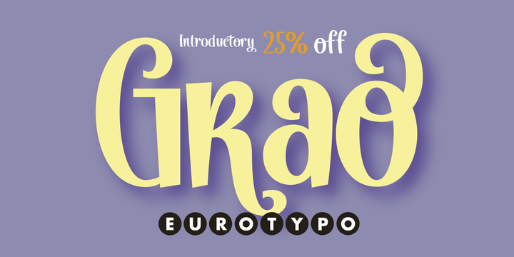
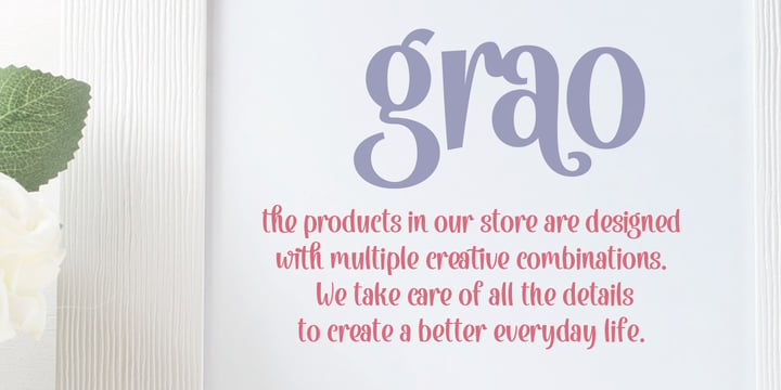
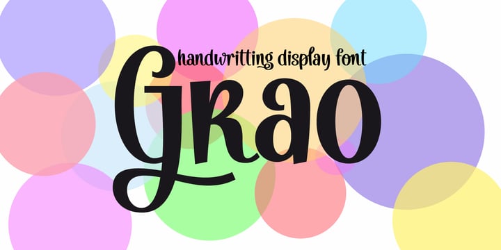
Grao is a modern, funny and casual script. All the glyphs have been carefully designed giving the texts a wonderful flow. A fat and thin blow in this font impresses the harmony.
This font includes alternative stylistics and contextual, swsh, and ligatures for a genuine handwriting effect. It also includes a Central European language support with its corresponding alternative characters to have more options in those languages.
Grao looks good in children's books, fashion, magazines, restaurant menus, book covers, wedding invitations, greeting cards, logos, business cards and is perfect for use in designs based on ink or watercolor, and more..
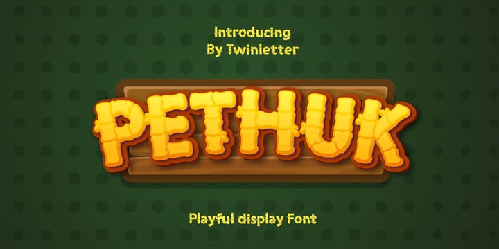
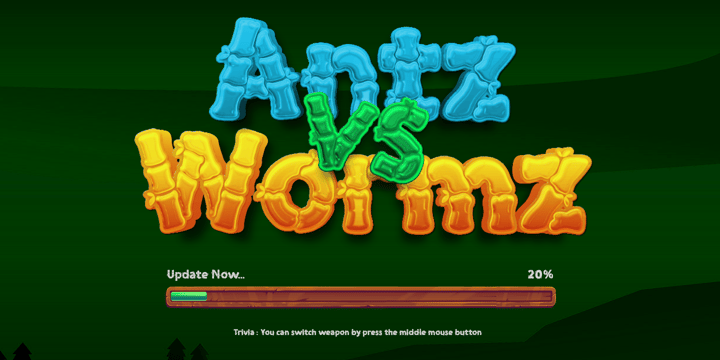
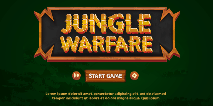
Pethuk is a bamboo-themed display typeface that was created with attention to provide a distinctive, elegant, and versatile font for your diverse project needs.
This display typeface is a lot of fun; get it today to give your project a bombastic flair.
This font is perfect for games, sporting events, branding, banners, posters, movie titles, book titles, quotes, logotypes, and more.
of course, your various design projects will be perfect and extraordinary if you use this font because this font is equipped with a complimentary font family, both for titles and subtitles and sentence text, start using our fonts for your amazing projects.
